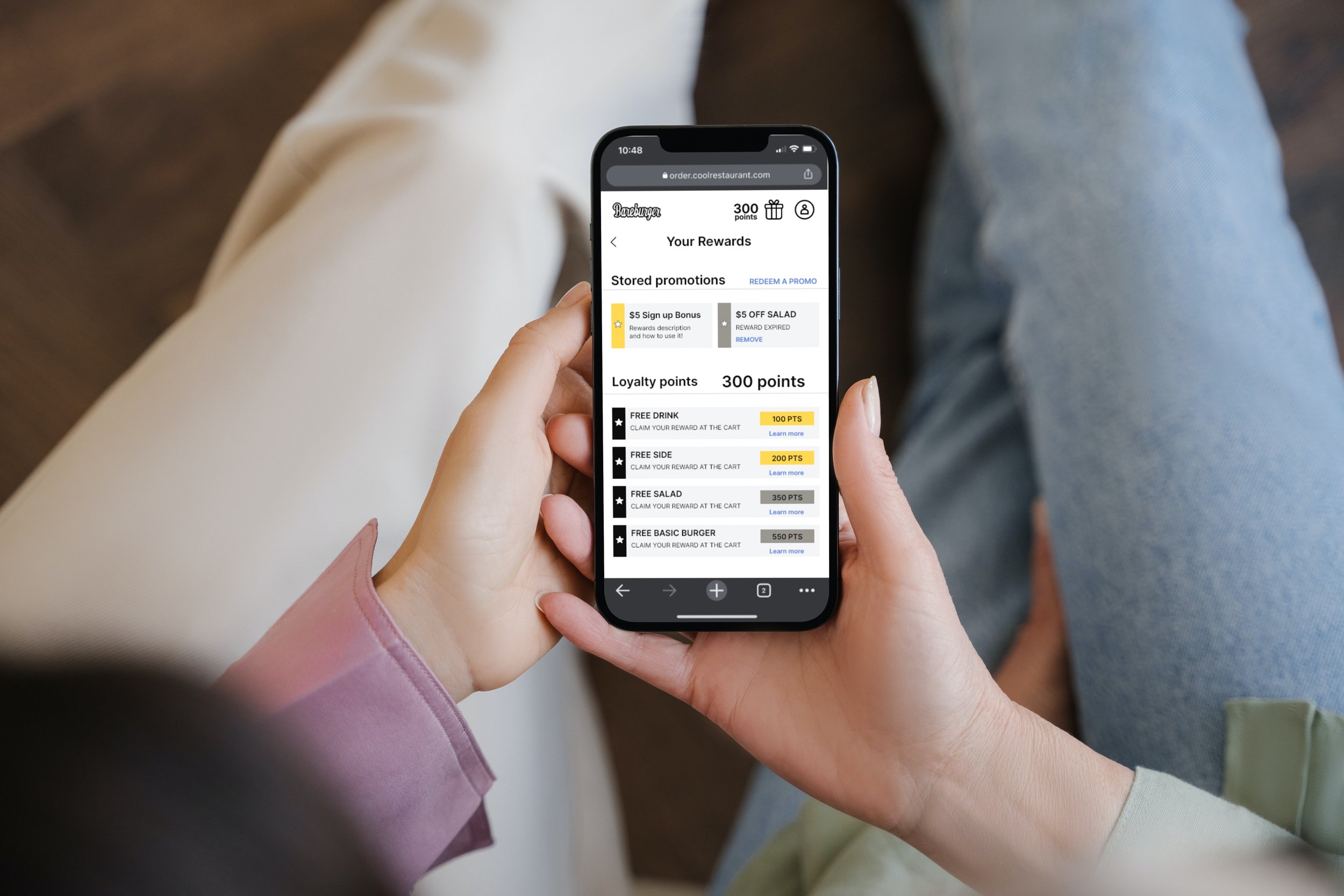
Loyalty Rewards Program • User Research & UX/UI
Loyalty rewards program
User research & UX/UI case study
Product Manager: Ryan Kennedy
Product Research & Design: Marija Golubovic
UI Design: Karen He
Objective
Understand how the users perceive the current reward system of a multiunit restaurant. Learn about the current engagement and rewards redemption pain points. Clarify users’ expectations and general needs. Test user perception of a designed solution and iterate on given feedback.
Problems we need to solve
Discoverability of the loyalty system
Redemption of the loyalty points and the complexity of the rewards system
Break down the usability and accessibility errors of the current solution in order to create a new one
Initial Assumptions & learning
In order to learn about the user experience, I conducted an audit of the current loyalty system. Observing the main platform as a whole, I was able to identify interaction pain points in the current design and discover opportunity pages that could be utilized to educate users and promote a loyalty system.
See the full audit ➡️ here & Here
Using a product analytics tool, I was able to observe user sessions, isolate top interaction errors and learn what the most vs. the least visited pages are. On the other side, I was able to discover how different interaction spots are perceived & utilized by end-users. We knew we needed to create a different system, but it was important for us to preserve some of the design users are familiar with in the current design solution.
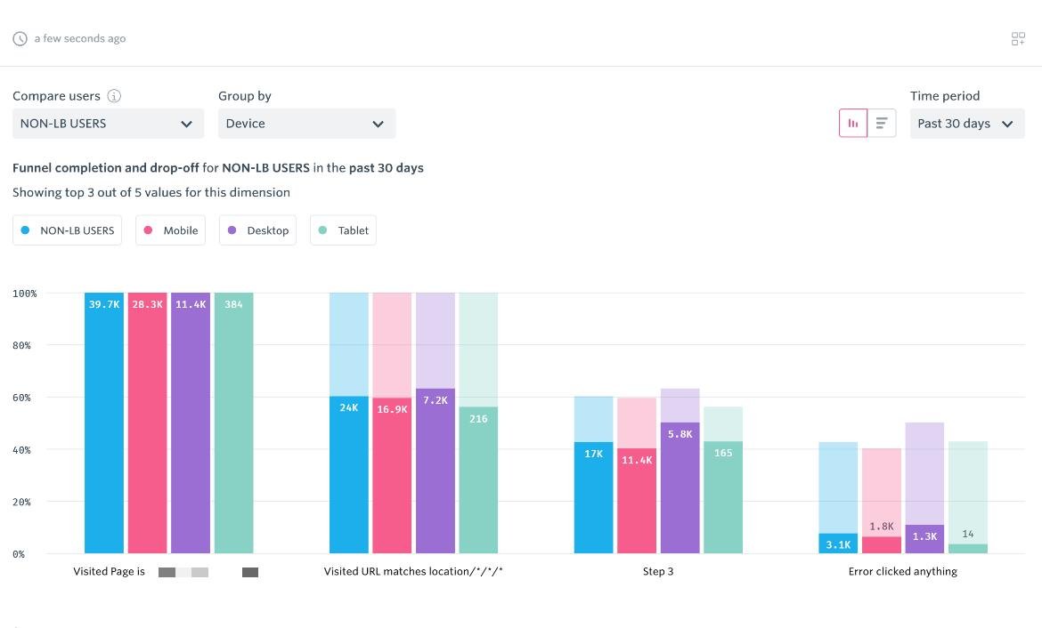
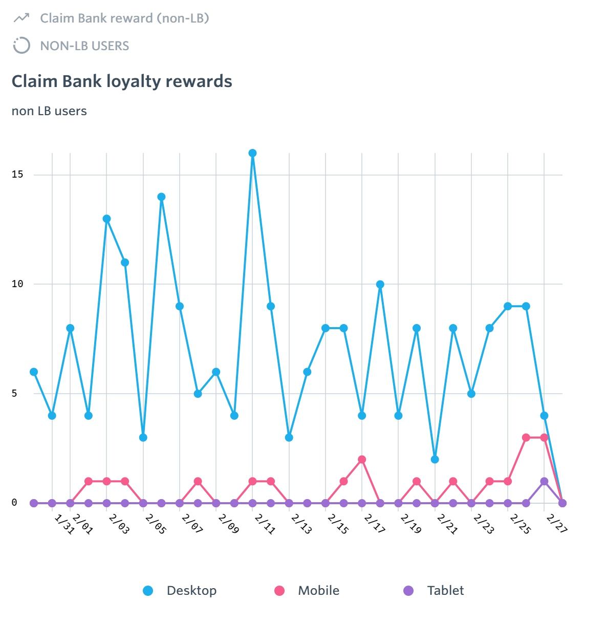
See the product analytics analysis ➡️ here
Competitor Analysis
During the discovery phase, I evaluated multiple loyalty systems available in North America. Primarily, I focused on direct competitors in the hospitality industry, but I also relied on indirect competitors with well-designed and broadly available loyalty systems.
My research consisted of analyzing the reward system as a part of the website experience, discovering reward system touchpoints throughout the user journey, and learning about features that make competitors stand out.
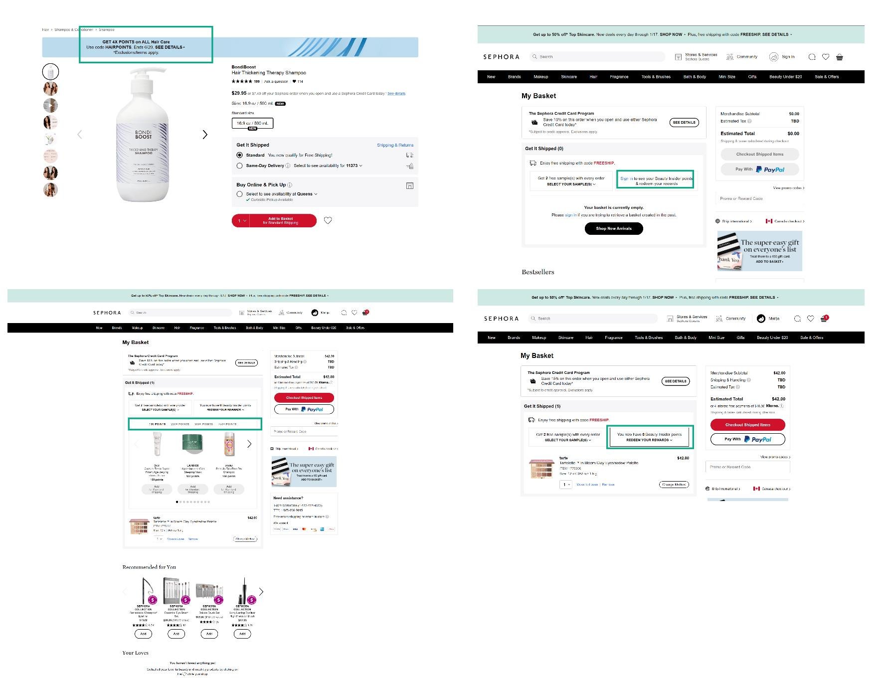
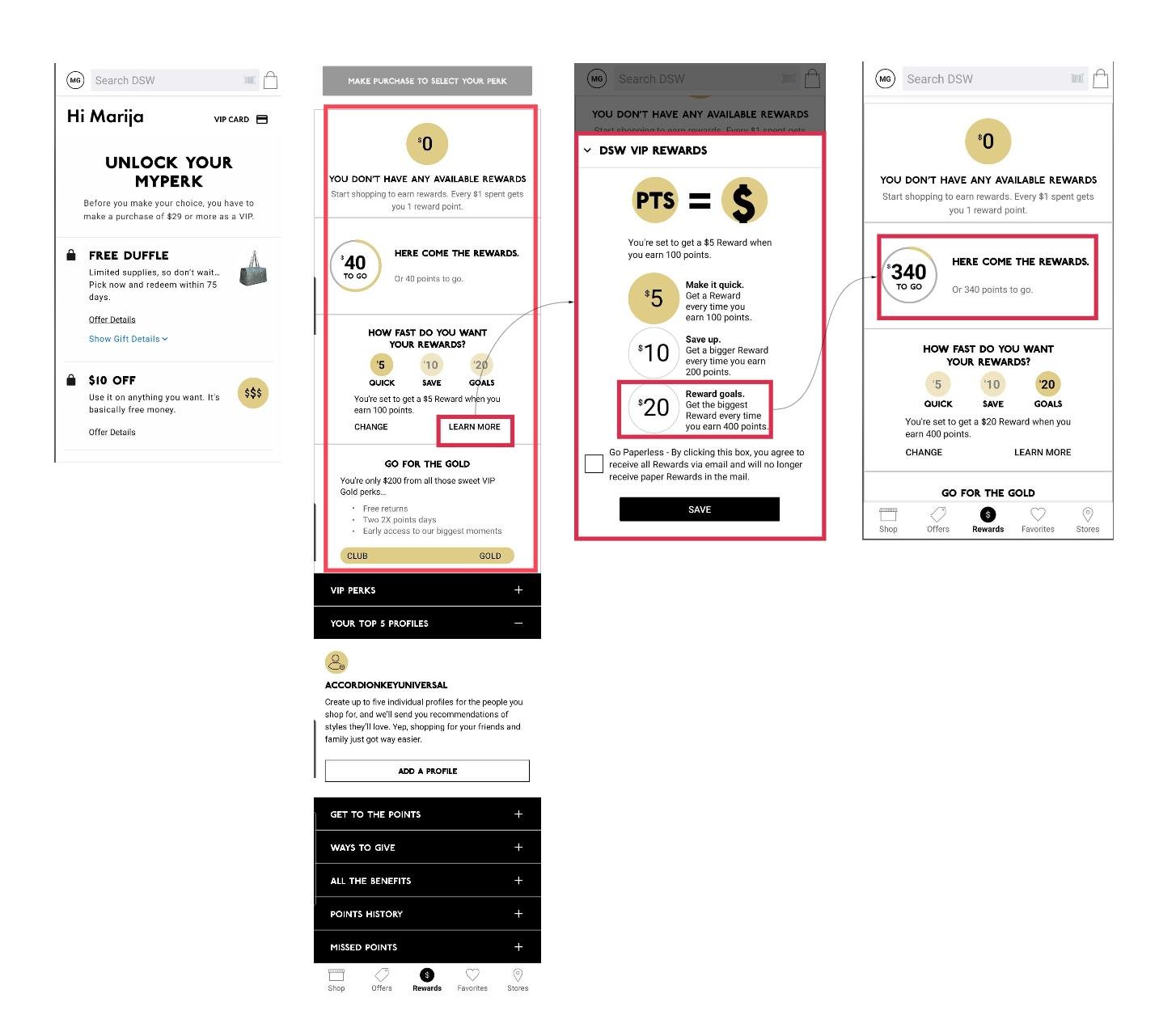
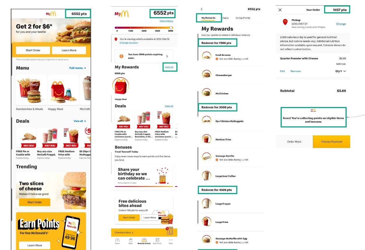
See the details of competitor analysis ➡️ here
Unmoderated usability testing
As a part of the discovery phase, I organized unmoderated usability testing via the User Testing platform. The recruited candidates are US-based, who regularly order from restaurants online, and are engaged in at least one loyalty program.
They were given a set of 10 tasks related to discovery and engagement with the current loyalty system.
Discovered findings
Users expect to become aware of the reward system at the beginning of their journey, way before arriving at the checkout page.
They want to learn about the reward system and understand the monetary value of the offered rewards.
They expect to see their loyalty status and to be able to track it
During the checkout:
if a user is not signed up, they should be given the option to engage and create their account before landing on the checkout page
if a user is signed into their account, they need to be encouraged to earn more points, and test participants clarified that by presenting how many points they miss to "unlock a new tier," "receive special rewards," "reach milestone" would be helpful
After the checkout:
if a user is not signed in, they should be prompt to do so by presenting the benefits of the loyalty program that goes with the account
if a user is signed in, they need to know:
how many points they earned with the most recent purchase
how many points they still need to earn in order to get to the next level or unlock new rewards
their current point progress
their past rewards and benefits
Concept Feedback
After analyzing initial learning based on current experience analysis and competitor analysis, we were able to create the initial design of the improved loyalty system.
I ran two rounds of interviews: one with test participants recruited from the pool of potential end-users (via the UserTesting platform), and the second one with Restaurant business owners who desire a new loyalty system for their brand.
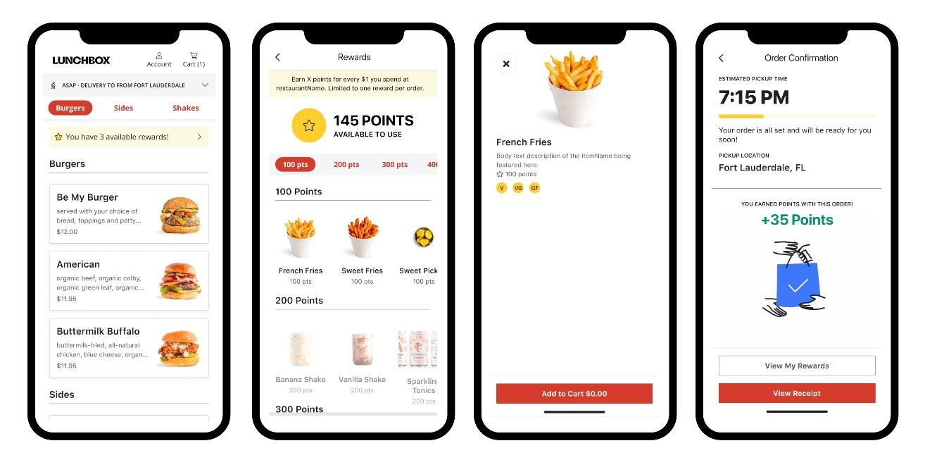
What did test participants say?
➖➖➖
The rewards section is missing on the menu page for the first-time users, and users can’t assume the rewards are nested on the Account page
Verbiage related to rewards is not attractive
Modification of the reward is not intuitive
➕➕➕
UX/UI is noticeably improved;
Multiple engagement points make the discovery of the system easier
Reward item preview enables them to learn about the item before the reward redemption
Point progress after the checkout is memorable and stimulative
What did stakeholders say?
Stakeholders provided additional ideas for the rewards system based on their goals to:
Inspire users to repeat the purchase ASAP
Create user behavior
Ease system discovery
Provide more rewards more often
They expect to reward the users early and often and inform them about the following:
Possibility to accrue reward points for more valuable rewards
Reward item customization
Possibility of redeeming Multiple rewards in one order
Open-ended Survey
According to the research analysis, We needed to discover and introduce more intuitive, simplified verbiage. We conducted a quick survey with 20 participants, who are internal stakeholders but also people with different demographic and ethnographic backgrounds who order from restaurants online at least once per week.
We wanted to clarify what kind of verbiage would be suitable for the Menu, Item, and Checkout page, as those contain the main touchpoints with the loyalty system.
Final Design
According to the inputs we received from end-users, internal and external stakeholders, we were able to upgrade our initial design solution and organize a short Usability study with the high-fidelity prototype. Again, we wanted to approach a broader audience, and we recruited our participants via User Testing platform. We recruited 5 people with different demographic and ethnographic backgrounds, who regularly order from restaurants online, and are engaged in at least one loyalty program.
Except the cosmetic issues we discovered along the way and suggestions for future iterations, our new design solution was well-perceived by the potential end-user.


